According to WHO, nearsightedness or distance vision impairment affects at least 2.2 billion individuals worldwide. Mobile platforms like Android should be made accessible to everyone, including those with disabilities, so that they can get access to knowledge Android users, amenities, and entertainment.
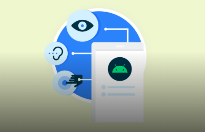
Users with a wide range of skills, such as those with cognitive, motor, visual, or hearing impairments, can use apps that are accessible to them. Your Android app can be made accessible to all users, regardless of their skill level, so that everyone can explore, engage, and profit from it.
With Android app accessibility, users are given a welcoming experience and obstacles are reduced. In order to meet those requirements, design concepts and features must take into account the preferences and needs of users with impairments. You will be able to meet regulatory requirements, attract more users, and improve the overall user experience by making your software accessible.
Android provides developers with a comprehensive set of accessibility APIs, tools, and standards that make it easier to create accessible apps. In addition to keyboard accessibility and color contrast upgrades, Android developers can also implement screen reader compatibility, alternate input methods, and more.
The accessibility of your app must therefore be continually assessed and improved in response to user feedback and new accessibility guidelines. By giving accessibility a high priority when developing Android applications, you can contribute to a more accessible digital ecosystem that allows people with disabilities to actively participate in society.
In this article, we’ll examine a few facts about the accessibility of Android apps, as well as provide helpful tips and best practices for building inclusive and accessible apps. If you follow these rules, you can make people with disabilities’ lives better by creating a user-centric experience that takes into account their needs and preferences.
Accessibility Principles And Practices For Android Apps
In order to create Android apps with accessibility in mind, certain guidelines must be followed.
Description of the content
Content descriptions are critical for improving the accessibility of Android apps for people with visual impairments who use screen readers or other assistive devices. When screen readers do not declare content descriptions or simply announce an “image,” users might struggle to understand the function or purpose of elements.
It is possible for screen readers to represent pertinent information effectively when developers provide concise and clear descriptions, enabling users to fully participate. Additionally, content descriptions offer crucial contextual information, helping readers understand the meaning of images or the function of buttons.
If you hire dedicated developers who are familiar with the Android design attributes such as the android:contentDescription attribute or the setContentDescription() method, these methods will allow users with visual impairments to navigate and interact with the app effectively.
Accessibility of keyboards
Users who may have temporary restrictions, such as hand injuries or circumstances where touch input is problematic, may also benefit from adapting their user experience to take keyboard accessibility into account. Developers can make a user experience that is more adaptable and accommodating and that takes into account different user preferences and situations by giving keyboard accessibility a priority. By placing a strong emphasis on keyboard accessibility, the app will be more usable and accessible to a larger range of users, encouraging equitable access and usability for all. This is in line with the inclusion principles.
Clarity depends on color contrast
Color contrast in Android app design is an important component of accessibility. Users with vision impairment and color blindness are guaranteed readability thanks to this. The developers improve the readability and usefulness of the app’s content by using the right color choices and adhering to accessibility guidelines. It is important to do extensive testing on a variety of devices under various lighting situations. Additionally, visual clues like patterns or icons are used to help comprehension. By emphasizing color contrast, an inclusive user experience is created that enables all users, regardless of visual or color perception ability, to interact with the app’s content and functionalities.
Support for gestures and alternative input methods
For Android apps to be more accessible and usable, gesture support and alternate input techniques are essential. Users with alternative input devices or motor impairments can navigate and engage with the app efficiently with these functions. Through adaptable interaction options such as directional swipes and trackball navigation, individualized experiences can be created that accommodate preferences.
Usability testing and feedback from users with motor impairments can be used to improve accessibility options by ensuring compatibility with external input devices. By maintaining an intuitive and consistent design, all users can explore, interact with, and benefit from the app’s capabilities, regardless of their motor skills or preferred input method.
Compatibility with screen readers
In order for people with visual impairments to access and understand app content, screen reader compatibility is important. By correctly naming user interface elements and using semantic markup, developers may ensure that screen readers such as TalkBack can communicate information appropriately to users. Organizing content logically and meaningfully is part of this, as well as including descriptive language for images, buttons, and other interactive elements.
A seamless user experience is ensured by thorough testing using screen reader software, which helps find any problems. App developers who prioritize screen reader compatibility make their apps more inclusive by making them accessible to people with visual impairments so they can explore, interact, and take advantage of the app’s features independently.
Size and scalability of text
Since can customize their app experience, text size and scalability are key factors for accessibility. In order to ensure that text can be adjusted without losing legibility or messing up the app’s layout, developers use scalable units like “sp” (scale-independent pixels) for font sizes. For users with poor vision or who prefer larger text sizes, this is beneficial.
Users can also modify the font size to their preferences by offering choices for doing so in the accessibility settings of the system or within the settings of the app. By prioritizing text size and scalability, developers improve usability and accessibility of the app, encouraging inclusivity and enabling users to customize the app’s visual presentation based on their vision.
In conclusion
The chance to empower people with disabilities and give them equitable access to the digital world is enormous. The guidelines and principles presented in this guide can help developers design inclusive user experiences that accommodate a variety of abilities. Keep in mind that accessibility is a continuous process, and it’s crucial to regularly assess and enhance the usability of your app depending on user input. Together, let’s work to create a digital environment that is more welcoming and conducive to participation and growth.
You may also like
-
Automatic Fruit Wine Bottling Line for Small Wineries: A Complete Guide
-
How Does Plywood HSN Code Decide the GST Rate for Traders and Manufacturers?
-
POS Terminal Type: Which Is Best for Your Business?
-
How to Choose Fixed and Portable Gas Monitors for Industrial Gas Detection?
-
Simplifying Trademark Registration in Hong Kong: What Businesses Need to Know