
Introduction
In today’s digital age, a well-designed website is crucial for businesses and individuals to establish a strong online presence. However, web design is a complex field that requires attention to detail and adherence to best practices. Unfortunately, many websites fall victim to common design mistakes that hinder user experience and impact overall success. In this article, we will explore the five most common web design mistakes and discuss how to avoid them, ensuring a seamless and engaging user experience.
Mistake #1: Poor Navigation

Poor navigation can frustrate users and hinder their ability to find information on a website. Overcomplicated menus, inconsistent navigation labels, and a lack of search functionality are common pitfalls that contribute to poor navigation. By simplifying menus, using clear labels, and incorporating a search bar, websites can provide a seamless browsing experience and help users find what they need efficiently.
- Overcomplicated Menus
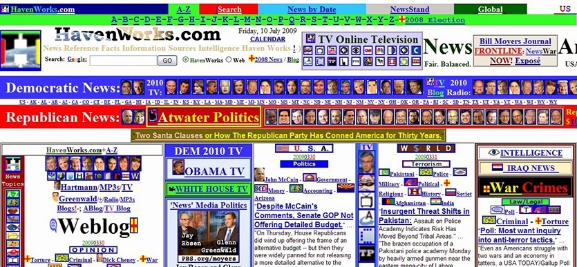
One of the most prevalent mistakes in web design is an overcomplicated menu structure. When users visit a website, they expect to find information easily and intuitively. Complex menus with multiple subcategories and layers can confuse and frustrate users, leading to a high bounce rate. It is essential to keep the menu structure simple, organized, and easily accessible.
- Inconsistent Navigation Labels
Inconsistent navigation labels create confusion for users, making it challenging to navigate through the website seamlessly. Using clear and concise labels consistently across the site improves user understanding and helps them find what they are looking for effortlessly.
- Lack of Search Functionality
A lack of search functionality can be a significant deterrent for users seeking specific information. Implementing a search bar on the website allows users to quickly find content without having to navigate through menus. Incorporating search functionality enhances user experience and saves time.
By simplifying menus, using clear labels, and incorporating a search bar, websites can provide a seamless browsing experience and help users find what they need efficiently. If you need assistance with improving your website’s navigation and overall design, consider consulting a professional Web Design Company.
Mistake #2: Cluttered Layout
A cluttered layout overwhelms users and makes it difficult for them to focus on important elements. Excessive content and elements, a lack of white space, and inconsistent visual hierarchy contribute to a cluttered design. Streamlining the layout, utilizing white space effectively, and establishing a clear visual hierarchy improve readability and create a visually appealing website.
- Excessive Content and Elements
A cluttered layout overwhelms users and makes it difficult for them to focus on the essential elements of a website. When there is an excess of content, images, or other elements, the website appears disorganized and unprofessional. Streamlining the design by removing unnecessary elements helps users digest information more effectively.
- Lack of White Space
White space, also known as negative space, is the empty area between elements on a webpage. Failing to utilize white space properly results in a cramped and visually overwhelming design. Incorporating adequate white space around key elements enhances readability, improves visual hierarchy, and provides a more pleasant browsing experience.
- Inconsistent Visual Hierarchy
Visual hierarchy refers to the arrangement and prioritization of elements on a webpage. When a website lacks a consistent visual hierarchy, users struggle to determine the importance and relationships between different elements. Establishing a clear visual hierarchy using size, color, contrast, and spacing ensures users can quickly scan and understand the content.
Mistake #3: Slow Page Load Times

Slow page load times can drive users away and negatively impact user experience. Large file sizes, unoptimized images and media, and excessive use of plugins and scripts can significantly slow down a website. Optimizing file sizes, compressing images, and minimizing the use of unnecessary plugins and scripts are essential steps to improve page load times and ensure a smooth browsing experience.
- Large File Sizes
Large file sizes, such as images or videos, significantly impact page load times. Slow-loading pages frustrate users and increase the likelihood of abandonment. Optimizing file sizes through compression techniques without compromising quality is crucial to maintain a fast and efficient website.
- Unoptimized Images and Media
Images and media that are not properly optimized for the web can slow down page load times. Techniques such as resizing images, using appropriate file formats, and leveraging caching mechanisms can significantly improve loading speeds. Balancing image quality and file size is essential for optimal performance.
- Excessive Use of Plugins and Scripts
While plugins and scripts can add functionality to a website, an excessive number of them can slow down page load times. Each plugin or script requires additional server requests, which can increase the time it takes for a webpage to load. Evaluating the necessity of plugins and scripts and minimizing their usage can significantly enhance website performance.
Mistake #4: Lack of Responsiveness

With the prevalence of mobile devices, websites must be responsive and adapt to different screen sizes. Non-mobile-friendly designs, inconsistent cross-browser compatibility, and poor adaptation to various screen sizes can result in a subpar user experience. Implementing responsive design principles, testing across different browsers, and optimizing layouts for various screen sizes help create a website that is accessible and user-friendly across devices.
- Non-Mobile Friendly Design
With the increasing use of mobile devices, having a responsive website design is crucial. Non-mobile-friendly designs lead to poor user experience on smaller screens, resulting in high bounce rates. Employing responsive design principles ensures that websites adapt seamlessly to different devices and screen sizes.
- Inconsistent Cross-browser Compatibility
Websites that do not function correctly across different web browsers create a fragmented user experience. Inconsistent rendering, layout issues, and broken functionality can drive users away. Testing and optimizing websites for compatibility across popular browsers ensure a consistent and reliable experience for all users.
- Poor Adaptation to Different Screen Sizes
In addition to responsiveness, websites should also consider the specific constraints of different screen sizes. Poor adaptation to varying screen sizes can lead to elements being cut off, content being hard to read, or a jumbled layout. Designing and testing websites to accommodate various screen sizes, including desktop, laptop, tablet, and mobile, ensures a seamless user experience across devices.
In addition to responsiveness, websites should also consider the specific constraints of different screen sizes. Poor adaptation to varying screen sizes can lead to elements being cut off, content being hard to read, or a jumbled layout. To learn more about creating responsive designs, check out a comprehensive guide on Responsive Web Design.
Mistake #5: Ineffective Call-to-Action (CTA) Design
CTAs play a vital role in guiding users towards desired actions on a website. Unclear or generic CTAs, weak placement and visibility, and lack of compelling copy can diminish their effectiveness. Designing clear and specific CTAs, placing them strategically, and crafting persuasive copy enhance user engagement and encourage conversions, ultimately driving the desired actions on the website.
- Unclear or Generic CTAs
Call-to-action buttons are essential for guiding users toward desired actions on a website. Unclear or generic CTAs that lack specificity can confuse users and reduce conversion rates. Designing clear, action-oriented CTAs that communicate the intended action effectively improves user engagement and encourages conversions.
- Weak Placement and Visibility
Placing CTAs in inconspicuous locations or using colors and designs that do not stand out diminishes their effectiveness. CTAs should be strategically positioned, visually distinct, and easily identifiable to attract users’ attention and encourage click-through rates.
- Lack of Compelling Copy
Compelling and persuasive copy is crucial for CTAs to drive user action. Poorly crafted or uninteresting copy fails to motivate users and diminishes the impact of CTAs. Creating concise, persuasive copy communicating value and benefits encourages users to take the desired action.
Conclusion
Avoiding common web design mistakes is crucial for creating an engaging and user-friendly website. By addressing navigation, layout, page load times, responsiveness, and call-to-action design issues, web design experts can significantly improve user experience and achieve better outcomes. Implementing best practices, conducting user testing, and continuously refining the design process is key to creating successful websites that delight users and drive conversions.
For more informative articles keep visiting here.
You may also like
-
Web Development Company in Chandigarh: Your Gateway to Digital Success
-
Best Cleaning Company in Dubai: How to Choose the Right One
-
Elevate Your Online Presence with Expert Web Design & Development Services
-
Where You Find Printer Rental in Dubai for Your Needs
-
ECommerce Website Development Services That Grow Your Brand